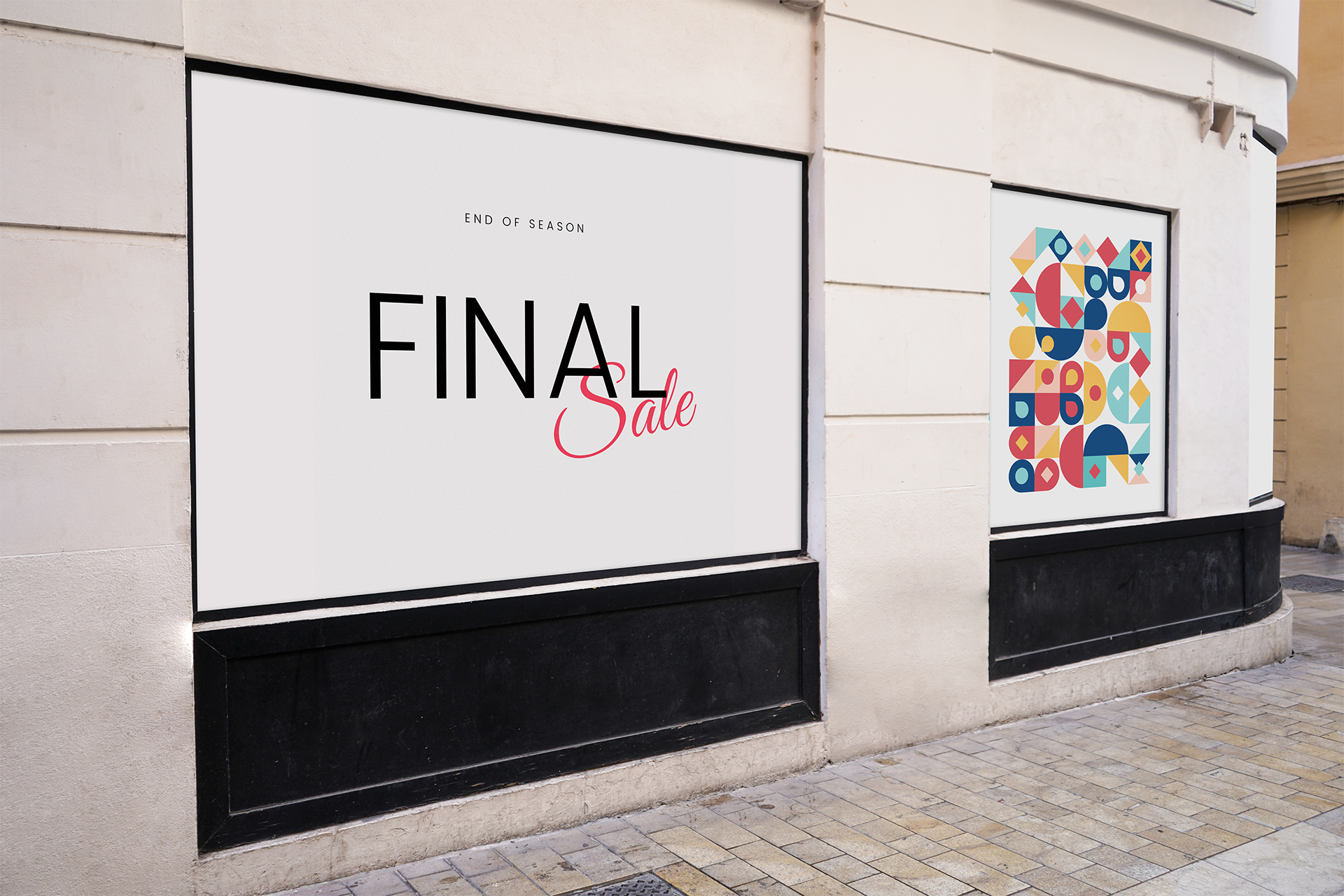
Large format printing is a printing technology that allows you to create large format images, texts and graphics on various materials.
It is used for the production of advertising materials, banners, posters, signs, photographs and other types of graphic products. The development of such layouts has its own characteristics and requires taking into account a number of nuances.
Layouts for printing
- Posters: Widely used for advertising, promotional material and interior decoration. They come in a variety of sizes, from small to huge, and require a layout approach with detail and image quality in mind.
- Banners: Usually used for outdoor advertising and placed on buildings, fences or stands. They should be attractive, clear and clearly visible from afar.
- Signboards are advertising structures that attract the attention of passers-by and potential customers. They must be clear and easy to read in order to convey information effectively.
- Billboards are large structures that are located on the streets or near roads. They should contain information that is easily perceived in motion.
- Placard: Used to advertise events, products or services. They come in a variety of sizes and require bright colors and attractive designs.

Requirements for layouts for printing
1. An important point is the formats and dpi resolutions. When developing a layout for printing, the choice of dpi resolution (dots per inch) plays an important role - the more dots we place per unit area, the clearer and visually better the final image will be. It is generally recommended to use 300 dpi for images that will be viewed up close to ensure high quality and clarity. For images that will be viewed from a distance, 150 dpi resolution can be used to increase the physical size of the finished product.
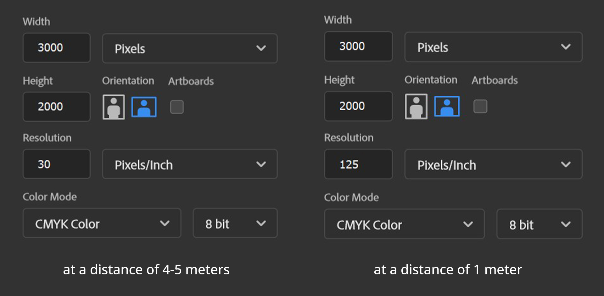
Let's look at an example: we have a task to create a layout measuring 3 by 2 meters. The optimal file size is 3000x2000 pixels, which corresponds to a resolution of 25.4 dpi at a scale of 1:1 (usually rounded up to 30 dpi). In other words, the image in this case will consist of dots, slightly less than 1 millimeter in size.
If we are talking about banners that will be located at a close distance (starting from 1 meter), then it is recommended to use a resolution of 100 to 125 dpi.
However, it is important to pay attention to the fact that the file size must be in real 1:1 scale. Otherwise, you can get from the printer, for example, a poster with a quality 10 times better, but 10 times smaller (30 by 20 centimeters).
It is important to remember that as the size of an image increases, its resolution decreases, so it is recommended to use higher resolution images for larger formats.

2. Color spectrum: be aware of the color gamut, which may vary depending on the type of print. Printers usually require the layout to be in CMYK. It is important that there is no color profile in the layout file (or you can use Default CMYK).
3.There is one more important detail - black color. Each print shop has its own way of getting black, but it's safe to say that if there are objects in the layout that are simply printed in 100% black, then they will look grayish, that is, not saturated black enough. This happens because the white material on which our layout is printed appears through the layer of black ink. This is especially noticeable on paper, as the ink "falls" into the paper and its color becomes lighter. Therefore, compound paints are used to obtain rich black. For example, the composition for black might look like this: C62 M51 Y50 K100.
4. Size and composition: When designing, consider the size and format of the printed material. It is important to create a composition that will effectively use the available space and attract the attention of the target audience.
5. Material type and quality: Different types of printed materials may require different settings and specifications. For example, poster paper may have different image quality requirements than vinyl banners.
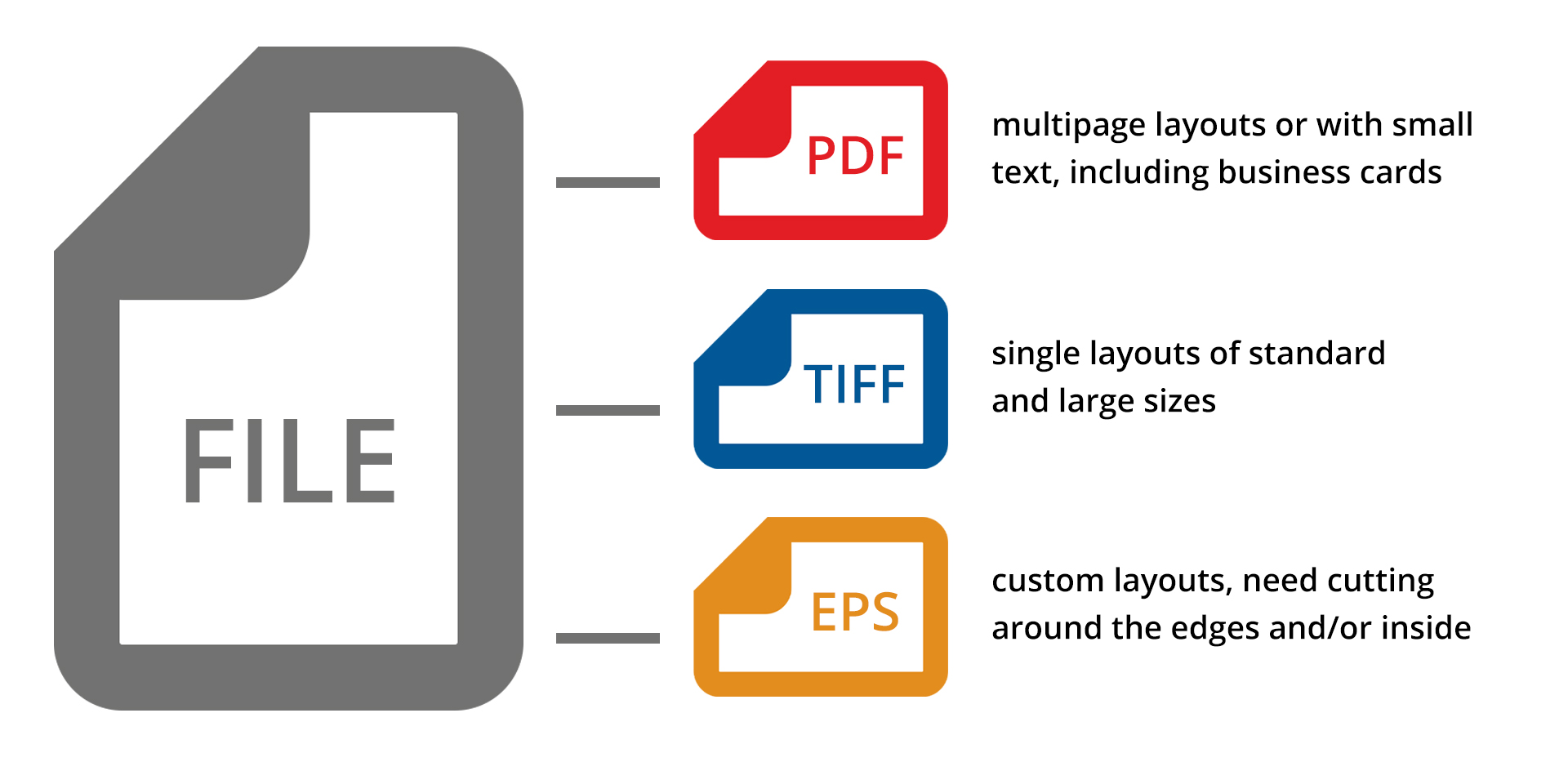
6. File format: Common formats for large format printing include:
- PDF (Portable Document Format): this is the most common format that ensures high quality and keeps all the elements in the design.
- TIFF (Tagged Image File Format): this format provides high quality and supports lossless compression, making it ideal for high resolution photos and images.
- EPS (Encapsulated PostScript): this format supports vector images and can be scaled without loss of quality. It is often used for logos and graphic elements.

There are additional requirements for layouts for contour cutting
- The layout must be provided only in CDR or AI formats.
- The cut outline must be vector, closed, and have a Hairline thickness. It should also be of a bright and contrasting color so that it can be easily distinguished from the rest of the layout elements. The cut lines should not intersect, and avoid creating complex and jagged corners with a lot of knots.
- The minimum height or width of cut elements must be 5 mm, and the distance between the cut objects must be at least 2 mm.
- When printing and subsequent contour cutting, it is necessary to provide for background overhangs by 2 mm and indents inside significant elements also by 2 mm. This will help to avoid the loss of necessary information due to the beating of the knife when cutting.
In conclusion, designing layouts for large format printing requires consideration of a number of nuances, such as image resolution, color gamut, size and composition, and media type and quality. Correct consideration of all these factors will help to create an effective and attractive layout that will attract attention and achieve your goals. It is recommended that you contact a wide format print specialist for guidance and advice on choosing the best settings for your layout.
